With the rise of social media, you’d be forgiven for thinking that emails would be taking a backseat, but the opposite is true. More people than ever are using email as one of their primary means of communication and connection to the wider world.
According to a World Health Organization (WHO) blindness and vision impairment report from 2023, at least 2.2 billion people globally have near or distance vision impairment. Of this, an estimated 193,000 people in Scotland are currently living with sight loss, with this number expected to reach 234,000 by 2036.
With these facts in mind, it is vital that each of us take steps to ensure emails are accessible to those with visual impairments, and inclusive for everyone.
What is email accessibility?
Making your emails accessible means taking steps to ensure everyone can open, read, and engage with emails easily.
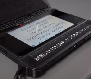
People read their emails in different ways for a number of reasons. Those with poor eyesight or visual impairment may use assistive technology and tools to aid them, such as screen readers. Therefore, it’s important that adaptations are made with these tools and technologies in mind.
Some tools allow the users to change display settings themselves, including enlarging text and images, changing font style and spacing, or increasing colour contrasts. But there are additional measures you can take to help too.
5 simple steps to make your emails more accessible
1. Structure and headings
Structuring your content in a clear and visible way is one of the simplest steps you can take to improve accessibility. You can do this by:
- using headings to organise content so that screenreaders can navigate through your emails easily
- mark-up headings correctly (H1 as the title or primary heading, H2 for sub-headings, H3 for sub-sub-headings, etc).
- using a consistent and logical layout
- balancing images and text to break up sections
- use bullet points and lists to break-up content
2. Font size, style, and spacing
Setting up a default font size, typeface and line spacing to be used across your email communications can ensure accessibility as well as consistency. We recommend:
- a minimum font size of 14
- an accessible typeface such as Arial, Calibri, Helvetica, Tahoma, or Verdan
- 1.5 line spacing
3. Colour contrast
Use a colour contrast checker to ensure there is sufficient contrast between your text and your background for readability. Tools like WebAIM: Contrast Checker can check that your emails meet the necessary levels for accessibility, and can help you make adjustments.
You can send out test emails to check how your email displays on different servers - for example, the same email in Microsoft Outlook can display differently in Gmail - and switch your settings between light and dark mode to make sure that your colourways work in different display settings.
4. Alt text
Add meaningful and descriptive alternative text to images, icons, graphics, and any other non-text content within your email. Alt text should explain what the image is showing and be descriptive but brief.
Avoid using non-text content that displays information that is important for the reader to see in order to understand, such as graphs, unless this information is detailed within the alt text.
5. Link text
Link text should be meaningful and indicate to readers exactly where a specific link will take them without them having to have read the surrounding content.
Instead of ‘find out more’ and ‘click here’, use descriptive text such as, ‘Read our article on the connection between sleep and sight loss here’ or ‘Find out more about our fundraising opportunities here’.
6. Bonus tip! Video captions and transcripts
Make sure all your multimedia content is accessible by adding video captions (as opposed to subtitles) and transcripts.
Further recommendations
The W3C Accessibility Initiative is a great resource for individuals and organisations alike to improve inclusivity and reach a higher standard of accessibility. The W3C page here is especially helpful in exploring how different people use digital technology so you can understand the recipients needs even better.
You may also be interested in
Learning to use digital technology with sight loss
RAF veteran Jim has macular degeneration. Read about how his Synapptic tablet has 'changed his life'.
How Royal Blind School pupils use BrailleNote devices for word processing and emails
How Royal Blind School pupils use BrailleNote devices for word processing and emails.